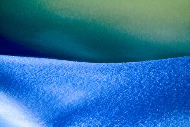
This was taken at the edge of the river. The top half is river ice and the bottom half the snowbank. I heightened the contrast and maximized the saturation. I love the blue/green result.
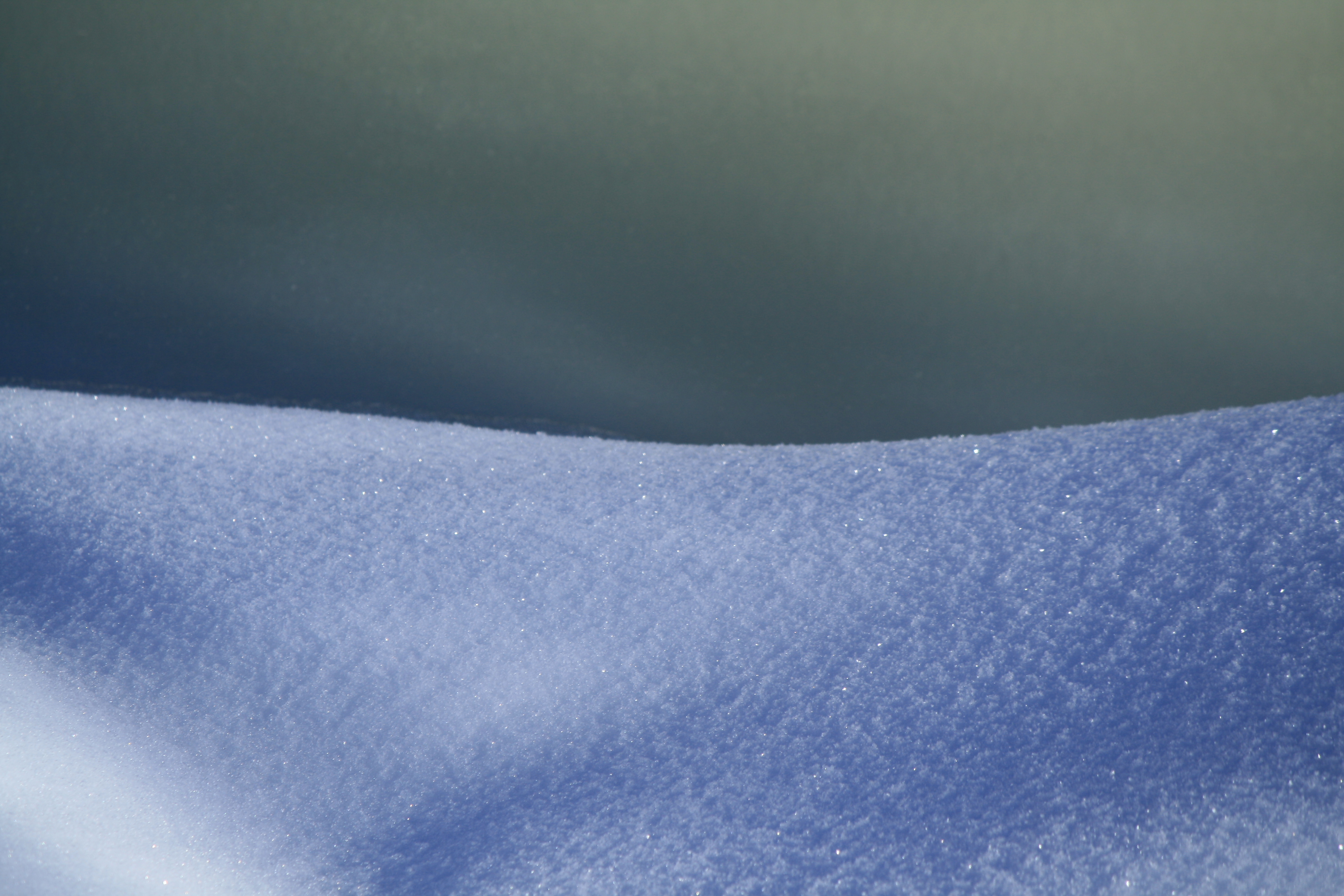
Below is the original for comparison. What do you think?
This was taken at the edge of the river. The top half is river ice and the bottom half the snowbank. I heightened the contrast and maximized the saturation. I love the blue/green result.
Below is the original for comparison. What do you think?
| Maria on IAVOM – First Dahlias | |
| Karma on IAVOM – First Dahlias | |
| LightWriters on IAVOM – First Dahlias | |
| dawnkinster on Silent Sunday – Bog Refle… | |
| Tails Around the Ran… on IAVOM – First Dahlias |


![]()
Unplug, breathe, Awakening the Soul Through the Stillness of Nature
The daily life of an addict in recovery
In love with gardening
My Life through the Viewfinder/LCD
...but change is certain.
casual scribbles of existence
Exploring sustainability
Awesome Travel Experiences | Best Places To Visit | Great Things To Do
In nature, we find hope, praise and harmony.
A 50 year Anniversary Blog started August 2023, of gardening experience in a harsh zone three climate, daily challenges and successes.
Musings on cats, travel, gardens and life
A Photo Journal
This is where my soul exhales in verse — welcome to my uniVerse.
Notes from the field, essays, and observations.
Poems, Poetry and more
adventures in my gardens
Sewing is my passion
Shelley M. White -Author: Cannabis for Lyme disease // Clinical Herbalist: Lyme disease and co-infections // Yoga Instructor // Nutritionist
"Consider the birds of the air...."

Dabbling in the black arts of post processing I see Eliza …you know which one I like 8^)
Yes, I certainly have, thanks to your prompting! Reluctant student at first, but I’ve come to see how it can help and in this case, is downright fun!
Beautiful!
Thank you!
I like them both, Eliza, though the top one is more dramatic.
How close was the lens to the snow’s edge/river? It seems like maybe it was a couple feet. But there’s also an illusion (especially in the first photo) that it’s miles away, and what’s really been photographed is the horizon and the northern lights. Quite a nice effect. 🙂
Thanks, Michael, I value your comments! I stood about twenty feet away with a zoom lens close up. I thought it looked a bit like the aurora borealis as well. It was a fun exercise.
Too cool!
🙂
I like it! Have fun + explore:-) I just love exploring in some of the new elements + playing with photos…I like it + push your limits:-)
Thanks! 🙂
of course you should know by now I love abstract + color! tee hee…I was a modern dancer in my former life BK!
Really? Professionally? Do you still dance? I love learning new things about my blogging friends! 🙂
I gave that up before I had kids many moons ago, but yes professionally. I was a modern dancer. I love the abstract + improvisation in all arts!The best years were when I trained younger dancers. I gave it all up in my late 20’s.Now you have to realize my youngest just went off to graduate school! I am older but not old yet!!!I went back to school and started another career…and now I am starting another..Isn’t life grand! I get bored, so it is good I have a mind that likes to learn new things..yes, us wise women never get bored! Keep on shooting, love to see what you discover!
Thanks for your encouragement! 🙂
I have found it rather fun to explore what else you can do with photos. Mixed media photos are very interesting. Some artists are even putting their photos on fabric + doing some very interesting things!
This would make a lovely fabric wall hanging. Cool thoughts!
I have been wanting to explore this for the past year. It look exciting, but have to find the time to set it up. Look what we can do with photos we take:-)
Oh, wow, very cool. I have a friend who does quilting, I’ll have to share this with her. Thanks!
🙂
My original thought of the altered photo was “that would make a beautiful painting” and then I saw the original and thought “what a beautiful photo”! I often take photos, tweak the colors as you did, and then make a painting using the new vibrant colors. I think the original has so much going on in a beautifully understated way. Nice!
Thanks Bernadette!
I love the vibrant colors so much. Actually both are so cool. You have a good eye.
Thank you so much for your kind compliment! Some days I can walk around and seem to capture nothing. But the day this was taken was magical – the blessing of one exciting shot after another. Some days we’re just in perfect alignment. 🙂
They are both beautiful in their own way – one vibrant; the other subdued loveliness.
Thanks for your feedback. That’s why I presented both, they each have their merits. Digital really allows a wide set of options. It’s fun to let one’s creative juices flow! I think I could do a whole series just on this one image alone.
Northern lights!
I thought that, too. 🙂
Wow, what a beautiful picture. I just got my first reflex and am doing my best to understand how it works!
Thanks! Yes, the learning curve is always a challenge. Be patient with yourself and take it one day at a time. You will figure it out with practice. 🙂
Both images feel as if they’re taken on a planet far far away. The original is the planet looking out into space. The 2nd post-processed image looks as if it’s on a different more dynamic planet. Mature planet (1) and children’s planet (2). I like them both very much.
Thanks for sharing your thoughts on these. They do seem otherworldly, don’t they? Definitely terrestrial.
this is just gorgeous!
Thank you, Geraldine. Hope all is well with you. Enjoy your weekend!
I love them both, but blue and green is my favorite color combo :-). And so needed right now!
ethereal!
Thanks! 🙂